
Illustrations
Role
Senior Product Designer
Year
2021
Company
Reed.co.uk
Reed.co.uk is the UK’s leading job site, featuring vacancies from over 25,000 recruiters a year. Each month, more than 7 million jobseekers turn to reed.co.uk in their search for work, making over 160,000 applications every day. Our mission is simple: to help the world Love Mondays.

Goal
Update and modernise the icons and illustrations in line with current trends and on brand.
The Opportunity
Enhance user satisfaction by improving the app experience and advancing design maturity, while also providing clarity and a little delight.
The Approach
Competitor review
Discovery
First iteration
Second iteration
Ideation Workshop
Final iteration

Competitor Review
Looking at our competitors and how they utilise icons and illustrations we could see there was a great opportunity to differentiate ourselves from them.
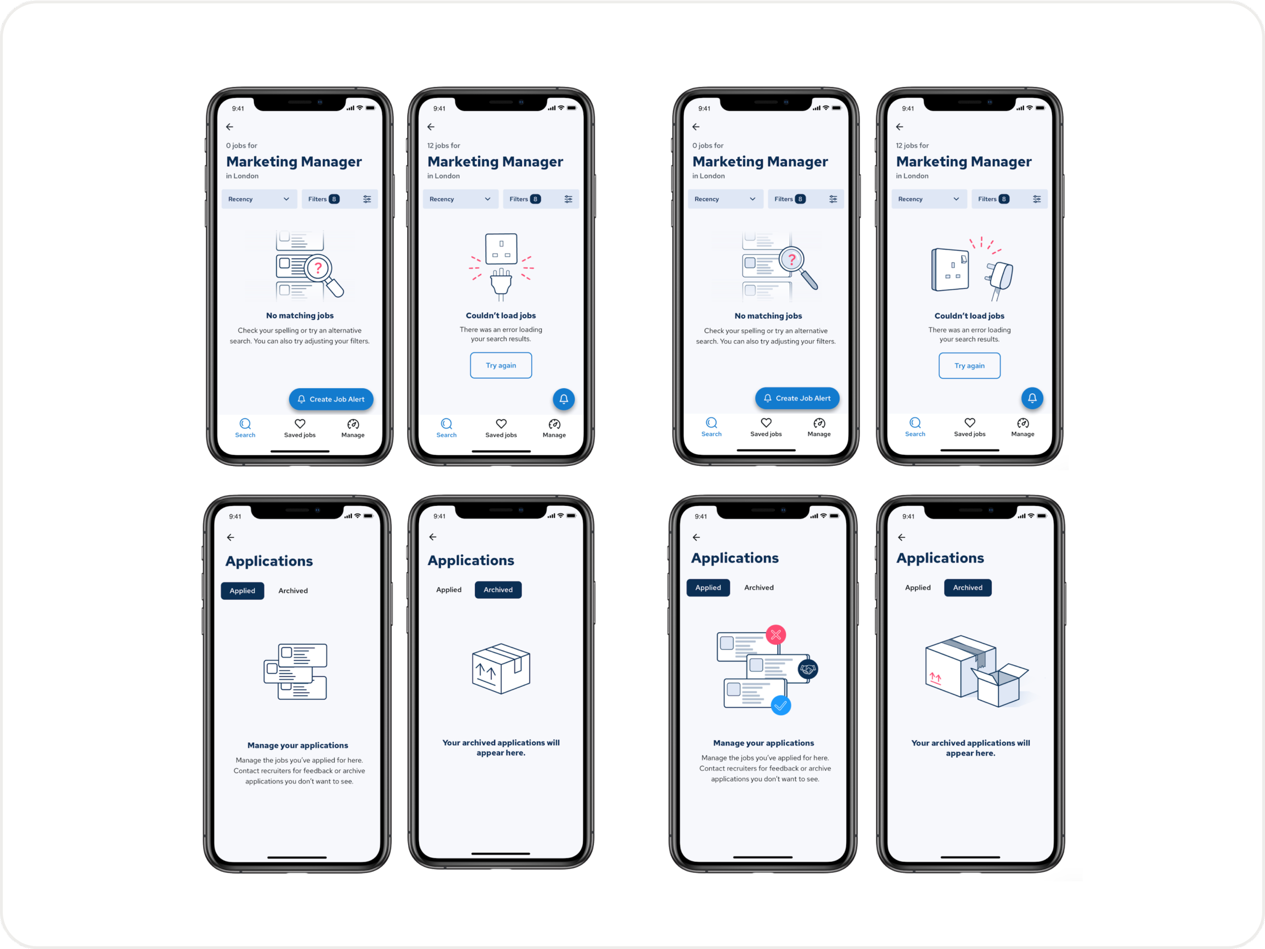
One of the main areas to utilise illustrations are empty states, although seen by 2-5% of users, these are screens that can guide users whilst also bringing a little delight in their experience.
Looking at leading apps such as Airbnb and Deliveroo we could see great examples of how to use illustrations in product design.

Discovery
From discovery we narrowed our options to four: Reedbot, Photography, 3D design and vectors. Vectors and photography are commonly used online so they would be easily recognised. The disadvantage is that they are not necessarily original and so impact of a unique design would be little. 3D design and Reedbot are more unique and customisable options, however these would rely on an external resource and be expensive.

Define
After discovery we chose to go for a vector style. Although the preferred option was 3D design, COVID-19 meant we had to look at a cost effective solution.
3D design would have meant the requirement of a freelancer, this was expensive and meant we were dependent on them for any future images required. Vector style illustration was a solution that could be managed in-house but also allow for customisation.
We chose to go with a ready made library of people illustrations which we tweaked to fit our needs. This allowed us to work quickly and set us up to grow the illustrations in the future.

First Iteration
After presenting the illustrations to the board, they were seen as not being on brand. Especially the colours and the imagery of people were not seen as being consistent with current brand.
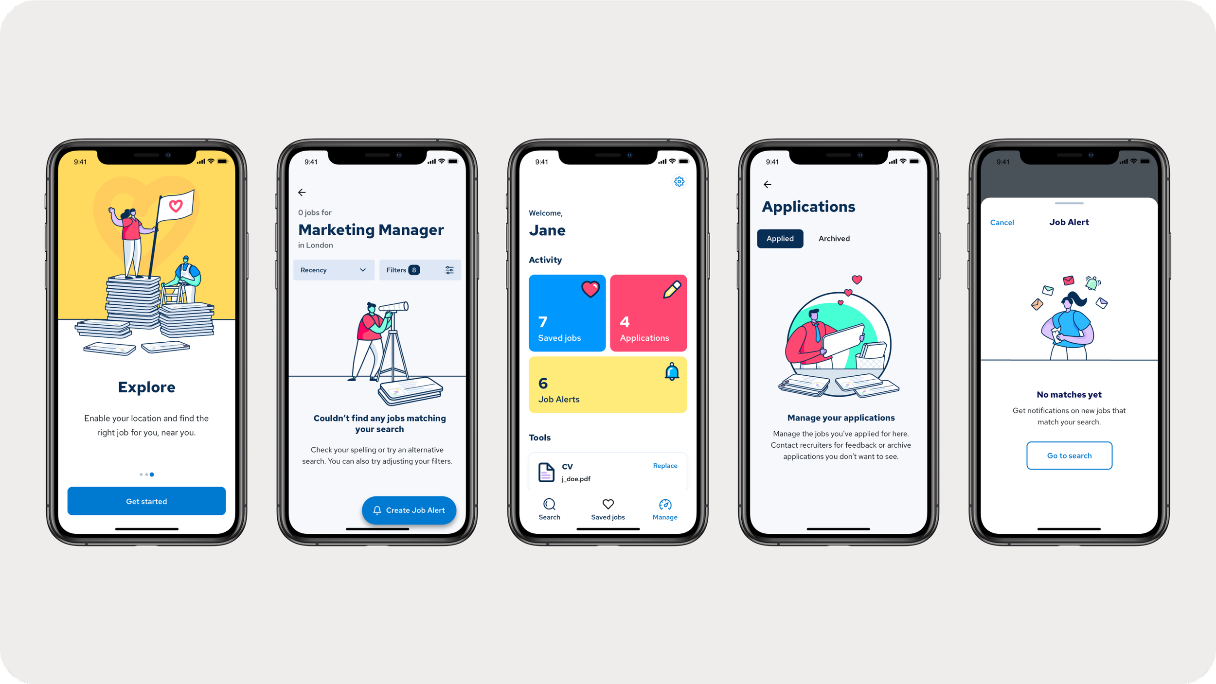
Second Iteration
Trying to iterate quickly and responding to the feedback, I worked on a new set of icons and illustrations. However, again these were not working and didn’t seem to be on brand. It seemed there was more to the feedback than just colour and people.
From the board feedback there was some concern around the usage of illustrations in general. Upon observing the current design system, it was true Reed.co.uk hadn’t used any illustrations to this point. To address this concern I ran a survey A/B testing the two styles: stylised icons and illustrations.
The results showed there was very little difference in the answers. Users thought both options were in line with our brand values: simple, relatable, positive and modern. Beyond this there wasn’t much else to learn from. In hindsight, the variants may have been too similar to draw a comparison.
Ideation Workshop
It was clear the previous approaches to illustrations weren’t working, we looked to reset with an ideation workshop. This time we would set out to collaborate with Marketing and Product to ensure we would stay on brand.
First we set out to define principles for our illustrations. This would help navigate conversations in reviews and keep the design team focused.
Illustration Principles
We represent everyday real life and people across the UK.
We are a proud British company, we use subtlety to communicate that.
We avoid cultural/gender/age stereotypes in the job roles depicted.
The subjects are performing positive action and illustration conveys motion.
We are unique, non-generic and not afraid to stand out. Our style is rich and beautiful.We delight our users with our imagery.
We’re bold, not boring.
Our users empathise with our illustration style.
Blue and pink are our primary colours (e.g. should make up 60% of the image).
The love heart should always be in (X) colour.
Don’t use competitor colours (e.g. green for total jobs, orange for indeed).
Next we looked at defining what purpose each screen the illustrations were going to be needed for. After, we carried out ‘crazy 8’ style sketches in response to the purposes we had outlined previously. We then used dot voting to filter out the best ideas to be taken to the next step.

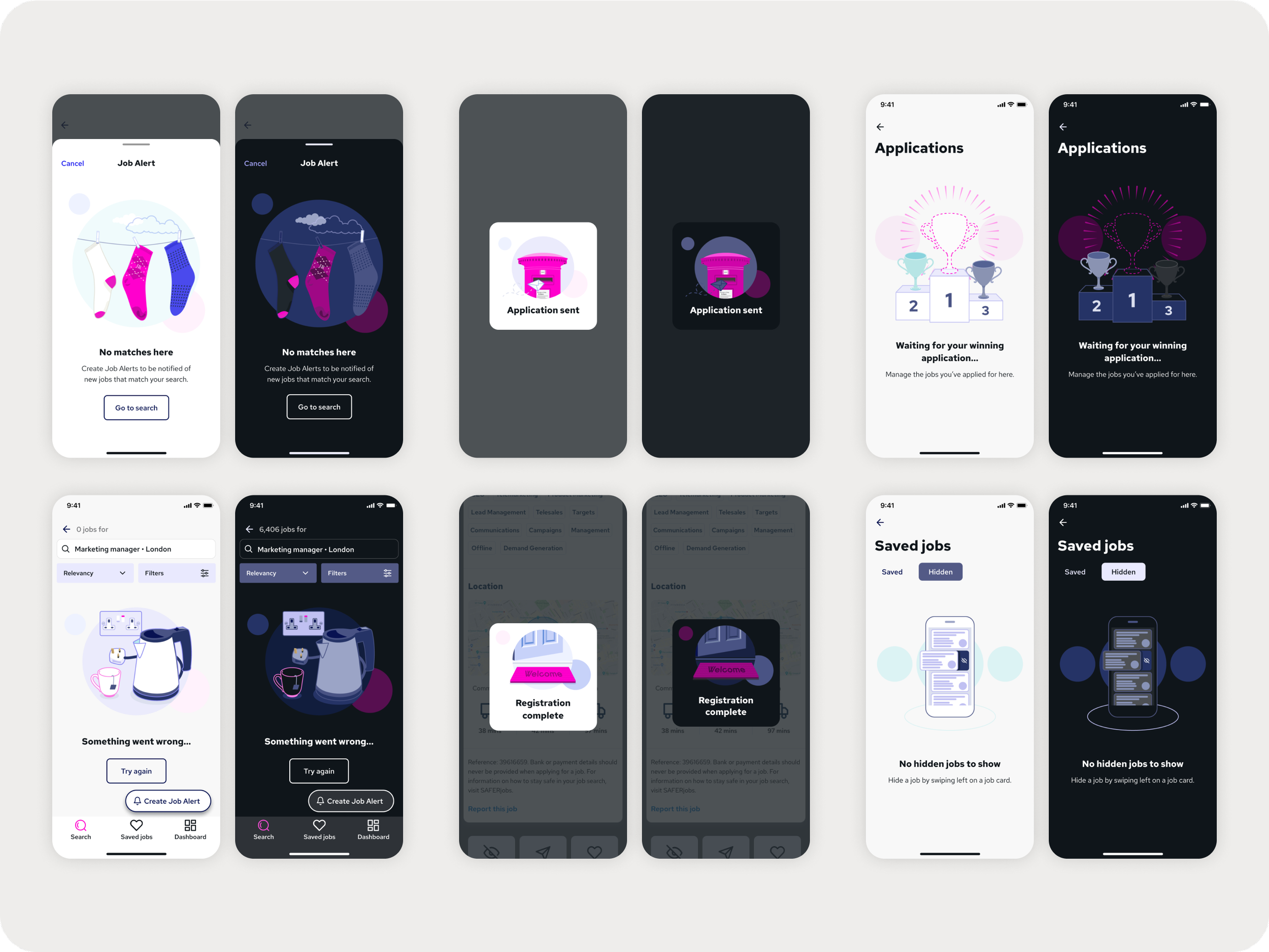
Final Iteration
These are the current work in progress of the illustrations. Lead by myself we looked to follow the illustration principles such as hints to British culture whilst keeping to the brand colours.
NOTE: colours used in these mocks reflect the re-brand project of Reed.co.uk.

Next Steps
We will be looking to measure the impact of the illustration in the following areas.
Pre-release:
A/B testing
Increase clarity to our users in their experience of the app.
User testing and survey
Differentiate from our competitors.
Modernise icons and illustrations in line with current trends.
Post-release:
NPS Score
Bring delight to our users in their experience of the app.
Analytics
Bounce rates
Session length
Future Vision
To continue looking at icons and illustrations for web and Marketing so Reed.co.uk offers a consistent, modern user experience.
Document all work for visibility and set up an accessible library for future use and iterations.
Learnings
On the third iteration, I realised I should have taken a step back to realise the feedback was more than ‘colour and people’. Defining the illustration principles really helped us to understand what being ‘on brand’ meant. It showed the importance of having principles in design so everyone is on the same page.
Another learning was that we hadn’t collaborated with Product and Marketing. This highlighted the importance of collaboration and buy in from the various stakeholders in the business.