
Doubling user engagement for a surgery preparation app
Role
Lead Product Designer: worked on strategy, research, facilitating ideation workshops, prototyping, testing, and delivery.
Team
Product Designer, Product Manager, 2 Back-end Engineer, 2 Front-end Engineer
Year
2024
Company
Surgery Hero
Summary
The redesign aimed to achieve a 50% engagement rate to demonstrate value to investors for Series A, focusing on three core areas: the onboarding journey, home screen, and goal creation.
In the onboarding journey, we highlighted the value and benefits of the service to set clearer expectations of the service and helped users get started with three easy steps. Key actions were prioritised to make the home screen easier to digest and use, while goal creation (essential for fostering habit-forming behaviour) was simplified by merging three features: health focus, custom goals, and trackers. As a result, the engagement rate increased from 9% to 42%.
About
Founded to address the challenges of growing surgery waiting lists, Surgery Hero increases the efficiency of both NHS and private sectors by improving patient outcomes through pre-operative preparation and post-operative recovery with the support of a health coach.

Business Objective
As Surgery Hero prepared for Series A funding, I was brought on board to redesign the app and ensure it demonstrated value to investors. Our objective was to increase the engagement rate to 50%, which will lead to more members successfully completing the Surgery Hero 12-week program. This metric would contribute to achieving better outcomes for both members and hospitals, including faster recovery times, reduced complications, and a higher number of members deemed fit for surgery.
The gains for the business include improved lifetime value (LTV) of members and a stronger position in the market. This project would not only supports our funding objectives but also strengthen Surgery Hero’s commitment to empowering members to make life changing habits for the better.

The Process
FIRST ITERATION
App Review
User Interviews
Competitor analysis
Ideation Workshop
Design Principles
Moderated and Unmoderated User Testing
New UI Exploration
Build Design System
Finalise UI
Release → 18% engagement rate
SECOND ITERATION
Opportunity Solution Tree
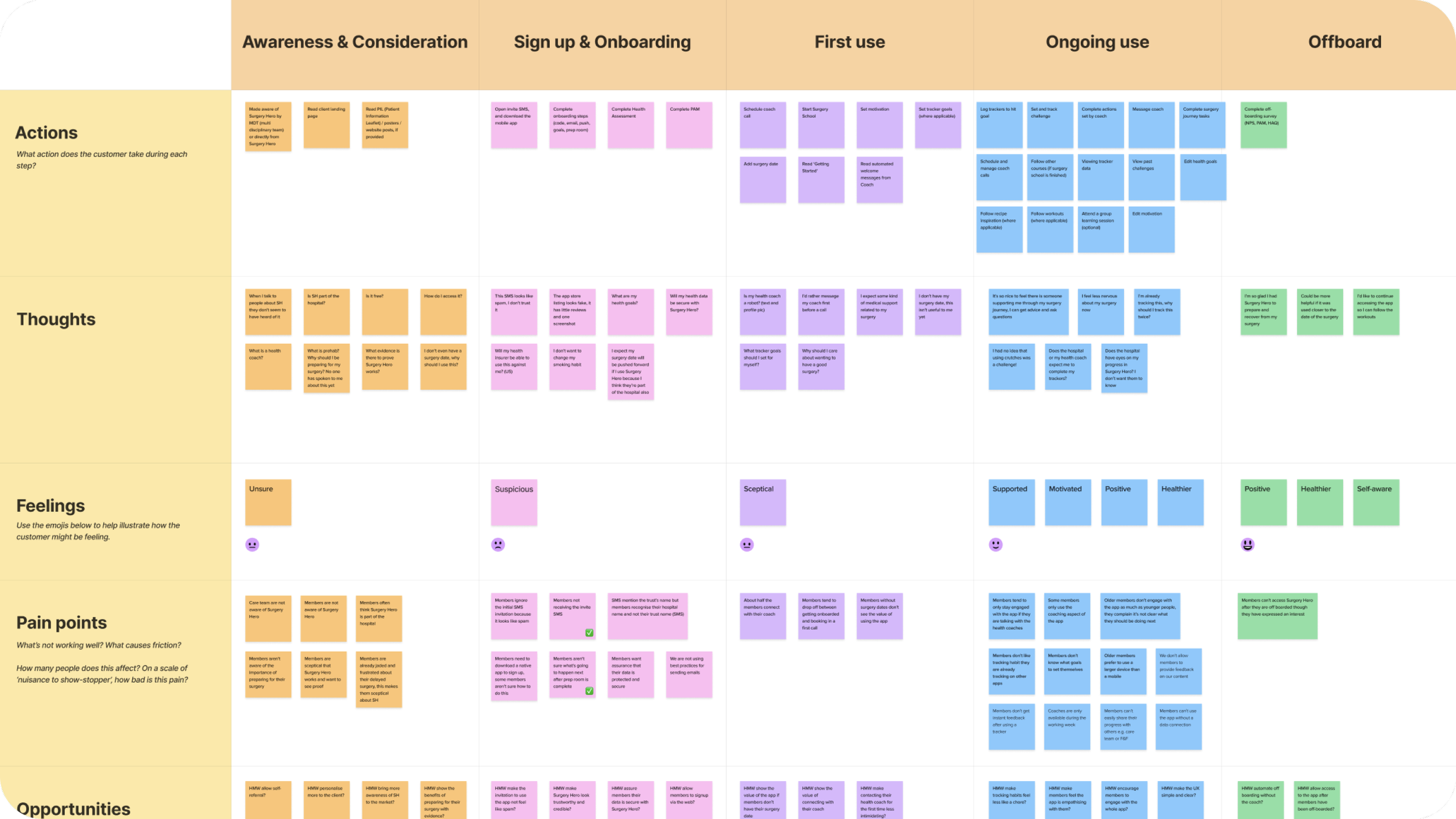
Customer Journey Mapping
Diary Study (attempted)
Competitor Analysis
Moderated and Unmoderated User Testing
Release → 42% engagement rate
The Problem
Only 9% of users were engaging with the app. Key themes and pain points identified from internal interviews across all departments suggested several reasons why.
The home screen is too busy, with multiple actions competing for user attention.
Members need specific custom goals for behaviour change; general goals for everyone are not effective.
The 'Challenges' feature (though closest to a custom goal) is underutilised.
Goals change throughout a member’s program, goals need to be reviewed and adjusted accordingly.
Ideation Workshop
After the initial research and gathering resources, I hosted an ideation workshop with individuals from Marketing, Coaching, Legal, Product and Tech team. After exploring various problems, we focused on two areas to solutionise on.
HMW keep the home screen simple and clear.
HMW help members make custom goals.
With these focus in mind, these were some of the ideas to come out of the workshop.
Try an action plan based on a weekly or a daily focus
Evolve challenges to be more aligned to SMART goals
Introduce binary goals
More education on creating a goal
Capture member’s confidence in creating their first goal
Introduce coach sign posting in relevant points


User Testing
We conducted both unmoderated and moderated prototype tests to evaluate the new app design, which included a revamped home screen, a new onboarding journey, updated trackers and goal management features.
Our objective was to determine whether the home screen was clearer and simpler, and to encourage the use of goals and trackers by making them more easier to find and create.
In the moderated testing members struggled to find the new goal and edit tracker buttons, found preset goals to be confusing and distracting, and encountered difficulties editing their health focus. Additionally, members were confused by the 'set up steps' task.
The unmoderated prototype test yielded a usability score of 6/10 and a Maze usability score of 65/100. We identified significant usability issues, such as difficulty in locating the new goal button, creating custom goals, and editing tracker buttons. Feedback indicated that users found the app overwhelming due to too many options, a lack of intuitiveness, and a steep learning curve for new users.
Overall, the prototype tests highlighted a need for further simplification and clarity in the app.
UI Exploration
While developing the new app, we began reimagining its appearance to better align with brand guidelines and values, which the current app did not fully utilise. Using the existing brand guidelines, we explored various UI options and strategies to introduce imagery within the app.

The Solution
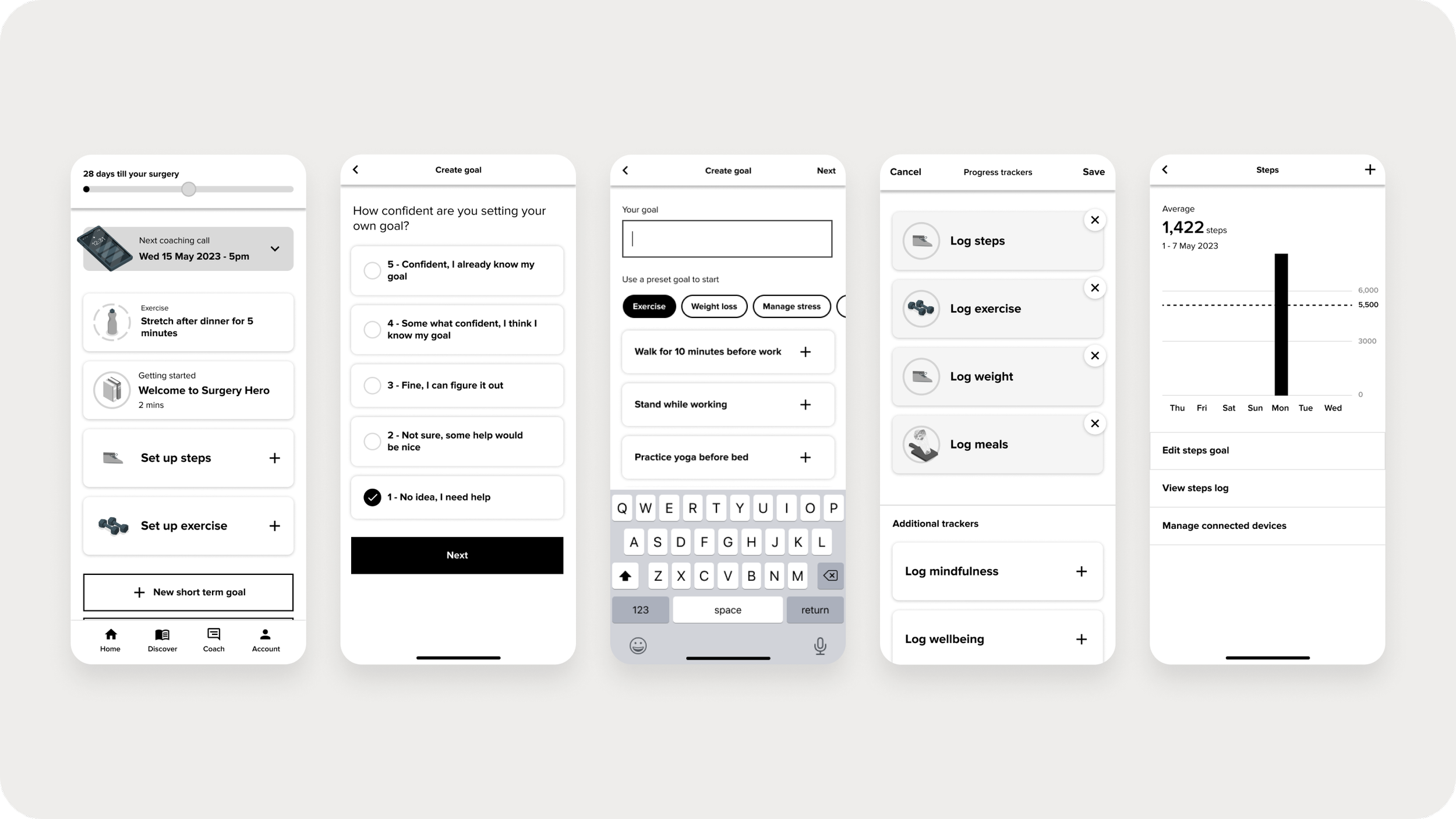
Improved onboarding journey: capturing surgery date, motivation and health focus.
Merged goal and trackers buttons on home to simplify options.
Added a screen to capture goal confidence when creating first goal to offer support to those who need it.
Separated preset goals from custom goal screen, removing option fatigue.
Able to access relevant course from home screen to keep members engaged with the app.
A refreshed UI to modernise the app and enhance its design maturity, including the addition of illustrations.
Implemented a new design system for consistency, efficiency and scalability.


The Results
Based on cohort average, monthly engaged users doubled from 9% to 18%.
Maze usability score of 69/100, showing the app was usable but with room for improvement.
Second Iteration
After the first iteration of the app we focused on optimising member engagement by improving the initial funnel of awareness through to first use of the member app.
The Problem
By mapping out the opportunity solution tree and the customer journey map, we identified key themes of issues related to trust, value, communication, and accessibility.
Member are unaware of Surgery Hero
Members think the SMS invitation to download the app is spam
Members are unclear on what to do next and what to expect
Members don’t know what goals to set themselves
Members think coaches are bots
Members are unaware of the important of preparing or their surgery
Members are unsure what a health coach does
Members don’t see the value when they don’t have a surgery date
Members don’t have relevant surgery content

User Testing
To address the identified issues, we tested a guided walkthrough of the app's navigation, simplified the landing experience into three simple steps, and integrated health focus with goal management with the ability to review and reset goals.
Our objective was to improve confusion and uncertainty. Members are unclear about next steps, what to expect from the app, and how to set personal goals.
The moderated user testing revealed that users' expectations of Surgery Hero shifted positively after using the app, noting it offered more than they anticipated. They recognised the app's focus on promoting a healthy lifestyle and provided favourable feedback on the coaching support. However, there was a clear demand for more surgery specific content, as users were uncertain about the relevance of a health and fitness app to their surgical experience.
In terms of goal setting, users were divided between choosing ‘gardening’ as a ‘custom goal’ or an ‘activity goal,’ yet they were able to locate both options effortlessly.
The unmoderated testing yielded a usability score of 76/100, indicating that most tasks were completed without major issues, aside from challenges with creating a goal, which echoed the findings from the moderated test.

The Solution
The final solutions concentrated on improving three key areas: onboarding, the home screen, and goal management, with the aim of enhancing the initial funnel from awareness to the first use of the member app.
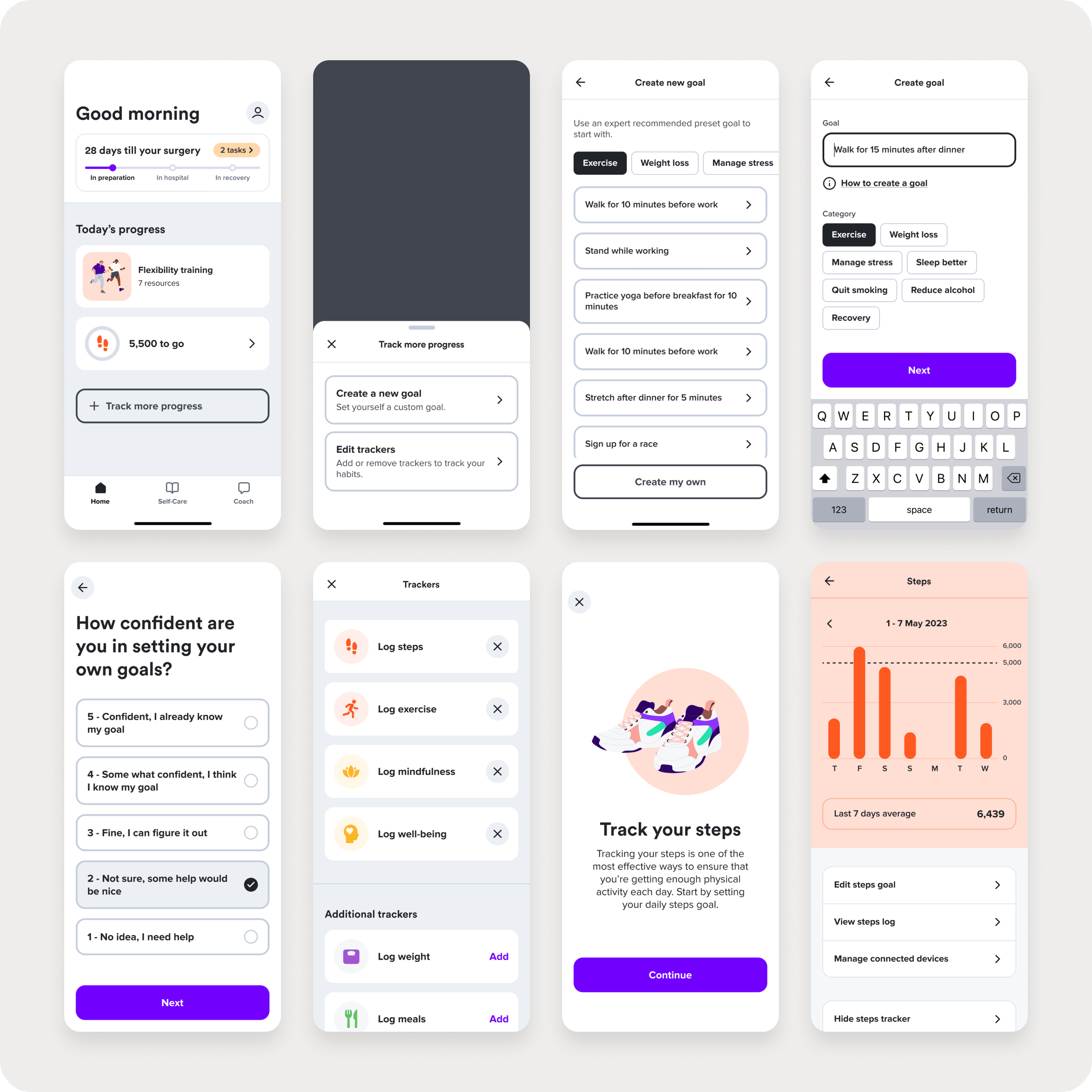
Onboarding
Added messaging throughout the onboarding journey to educate members on the benefits and what to expect from Surgery Hero.
Added a walkthrough guiding members through the nav so they know how to use the app.
Home
Clearly guide members on what to do next by providing a streamlined landing experience of just three simple steps to get started.
Simplified the surgery timeline to put focus on ‘Today’s progress’.
Goals
Merging of the goals, trackers and health goals to simplify creating goals. Put custom goals at the top of the list to encourage members making personalised goals required for behaviour change and align with coaching.
The ability to review goals which prompt members to set new ones, encouraging a continuous cycle of engagement and progress.
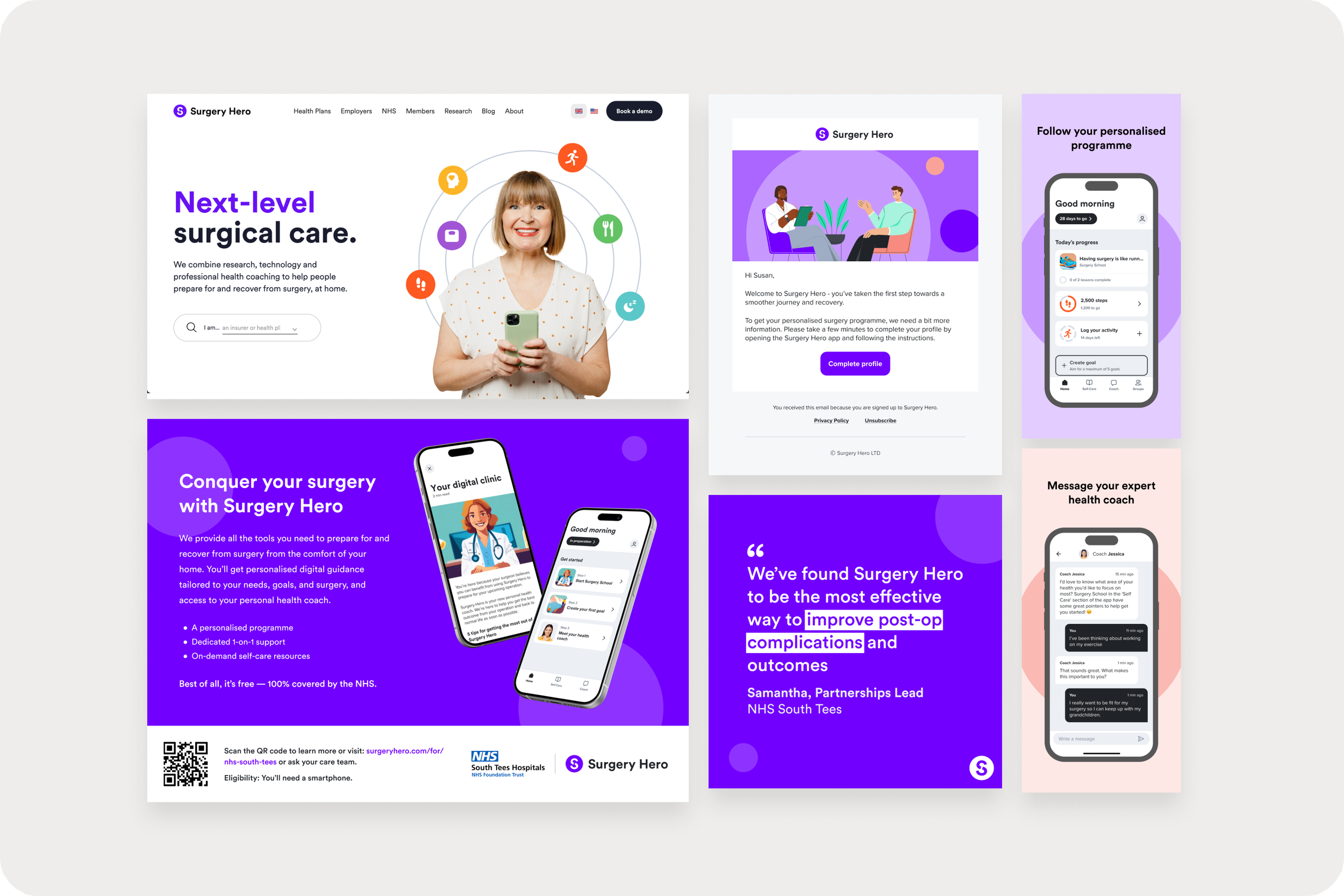
Improvements were implemented not only in the app but also throughout the user journey leading up to the sign-up process. The awareness phase has been enhanced to better align with the brand and proposition through updates in emails, SMS, push notifications, social media content, app store listings, website designs, and user surveys.

The Results
Monthly engaged users almost doubled with each iteration.
Before → 9%
First iteration → 18%
Second iteration cohort → 42%
From the first iteration the life time value of a user to user acquisition cost ratio increased by 180%.
Usability score increased from 6/10 to 8/10.
It would’ve also been beneficial to have seen the number of goals created, completed and the types of goals created at this point.


Challenges & Learnings
Attempting to test all new designs led to a diluted focus and a bloated testing process, leaving us with insufficient time to explore further iterations. Focusing on designing and testing key user journeys that target core issues will allow us to be more agile, facilitating the exploration and testing of additional iterations while strengthening our confidence in addressing these core problems.
Finding willing members to test with in a timely manner was frequently challenging, often leading us to test with non-members. Engaging Surgery Hero members would have provided richer feedback and greater confidence in our decisions. We should explore building stronger relationships with the Customer Success team and our clients to ensure a backlog of members available for discussions and testing.
Next Steps
To demonstrate the app's ongoing value, we anticipate that the following areas will increase the engagement rate to achieve our goal of 50%.
New features such as AI-powered chat and group chat in line with our product vision.
Explore how to help members without a surgery date perceive the app as valuable and relevant to their surgical journey.
Explore how to make the app feel relevant to the member’s surgery, as shown in user feedback on their expectations.
Explore how to re-engage the members who don’t come back after being onboarded.
Explore how to improve the retention rate over the 12 week programme who tend to drop off after week 1-3.